GNOME Shell Challenge Update - Analysis and Revelations
By Andrew Powell, published 03/07/2014 in Editorial
Well, amazingly, it's already almost been a full week since I started the GNOME Shell Challenge. I know updates have been slow to come, but rest assured I have been and still am using GNOME Shell full-time since the challenge began.
First of all, a few points from my experience so far:
- GNOME Shell's design is particularly aimed at being distraction-free as possible. Perhaps one might say a "less is more" philosophy. Arguably, the GNOME developers have taken away many out of the box functionalities to achieve this. Whether this is justified or not is likely a subjective thing.
- While missing some functionalities out-of-the-box, at least compared to it's predecessor (GNOME 2), GNOME Shell Extensions do actually provide a plethora of customizations and possibilities. As I said in the original article, I wasn't planning to use many extensions and that has indeed been the case. That said, even perusing the GNOME Extensions website shows many, many interesting possibilities.
- The likes of a window list and/or dock are not provided by default but can be added with the aforementioned extensions easy enough. They aren't provided out-of-the-box because, again considering the distraction-free design aspect, they could cause too much temptation to move away from your current focus.
- Interestingly, I'm the sort of user who would normally not hesitate to activate extensions for a window list or a dock. However, I too have opted to not use them. More on that a bit later.
- GNOME Shell is definitely a fairly unique UI and stands apart from most of the others. Again, whether or not this a good thing is subjective and depends on one's taste, but I don't think anyone could really accuse the GNOME devs of copying anyone.
Keyboard Power
I originally had the impression that GNOME Shell was a little bit unfriendly in regards to keyboard interaction of UI elements, especially compared to other "modern" interfaces like Canonical's Unity. Thankfully, this hasn't proven to be the case, as even a decent perusal of the GNOME Help application will show you.
A lot of the keyboard functionality isn't immediately obvious (perhaps the GNOME guys could improve this) but it is there.
Some interesting keyboard shortcuts:
- CTRL + H to minimize an application.
- CTRL + Enter on a selected application in the Overview to launch a new instance of an application.
- CTRL + Alt + Tab to give keyboard selection focus to the Top Bar, Windows or Message Tray. This allows you to select elements such as the Activities Menu, Clock/Calendar or the System Indicators (etc) with the keyboard only. Quite handy.
- Super + A brings up the Applications section of the Overview directly (as opposed to going to the standard Overview and then clicking the Show Applications button).
- Super + Arrow Keys snaps a window in the direction of your choosing. Super + Up Arrow maximizes a window, while Super + Down Arrow unmaximizes a window. Super + Left/Right Arrow snaps a window to the left or right, allowing you to quickly put two windows side-by-side.
- Alt + ` (or ~ key) switches between windows of the current application. This can be used together with the usual Alt + Tab (which in GNOME 3 switches between applications rather than per window by default) to quickly sift through programs and their windows.
My previous dabblings with GNOME Shell once revealed that the window previews in the Overview couldn't be selected with the keyboard - only with the mouse, which was a major downer, but could easily be fixed with an extension. Thankfully, in the latest versions it seems the GNOME devs fixed this, as one can easily select any of the Overview windows with the arrow keys now.
Application Switcher - More than Alt-Tab
The Application Switcher in GNOME Shell is an interesting one. I did originally think that GNOME Shell seemingly forced you to make more use of "Alt-Tab", even though most GUI environments include some sort of Alt-Tabbing interface, which in turn always gave me the impression that it (Alt-Tabbing in general) was a handy extra rather than an essential way of switching apps (OSX users probably already disagree with me here... but this is again a subjective thing).
Admittedly, GNOME Shell has gone some way to change my thinking on this. Perhaps, for users such as myself who have been brought up on "classic" interfaces and window lists, Alt-Tab is underutilized and can be expanded upon.
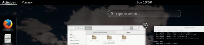
GNOME Shell's Alt-Tabbing interface is known officially as the "Application Switcher" for a reason - it actually does have extra functionality, that you might not expect in a typical Alt-Tab interface. I'd go as far even to say that it's in some ways the equivalent of, say, the Windows 7 task-list (or in Linux land, say the KDE Smooth-Tasks widget or DockbarX program). While it may lack the customization or app-pinning abilities of those examples, I'm mainly referring to the window previews and application window grouping. See the screenshot below if you're not sure of what I am referring to.
GNOME Shell Application Switcher in action
In this regard, it's almost like an icon task list that you bring up on-demand (Alt + Tab) but remains invisible while you are doing tasks. Like most GNOME Shell elements.
To expand further on this, it has to be said it isn't just controlled with the Alt + Tab keys. Alt + Tab brings up the interface as you expect and you can just use it as you would use any such interface in other desktop environment, but you can also use the arrow keys on your keyboard or the mouse pointer to move over and select the applications in the list. For example, left or right arrow keys will navigate over the applications in the list. If you have an application highlighted, simply pressing the down arrow key will bring up (along with previews/thumbnails) the individual windows of that particular application which you can also select. Same with using the mouse pointer, except as you run your cursor over the application icon in the Switcher, the window drop-down previews are automatically shown, in a similar way to the aforementioned Windows 7 window list or Smooth-Tasks, etc.
This was a fairly pleasing discovery to me, because it is an in-built functionality of the Shell and is an interesting alternative to the usual docks or window lists. It is however, not perfect of course. If you're like me, you may be use to mashing Alt + Tab quite quickly and you can still find yourself Alt-Tabbing too far and just generally making a mess of what should simply a quick key press or two. So it can be a little awkward. But still, it's a feature worth noting.
Extensions, extensions, extensions?
I made a point of not using too many extensions during this challenge, especially if they altered the Shell too radically, as I felt it would defeat the purpose somewhat. Most of us already know that GNOME Shell can be loaded up with extensions and twisted, bashed and smashed into resembling an entirely different desktop. Indeed, this is how GNOME Classic is achieved in the latest versions of the GNOME desktop - with extensions.
But I figure, with a plethora of more traditional desktops out there, why mangle GNOME Shell into resembling such a thing and potentially de-stabilize my desktop environment? I'm very concious of the fact extensions can cause stability issues and so I wouldn't use too many anyway. But also from the point of view of doing this challenge, I wanted to use a fairly vanilla GNOME experience, as the developers more or less intend it to be.
As such, I am currently only using these three extensions:
Really these are just nice convenient add-ons, rather than modifying core functionality, which I feel is a nice balance.
You may have noticed in my original GNOME Shell Challenge article that I was, at the start, using the Dash to Dock extension. Yet, I am not now. It is a pretty neat extension and possibly essential for some users, but I decided to turn it off for the simple reason that I was starting to make more use of the Application Switcher and the Overview, as well as starting to dabble with workspaces (even as a Linux user of some years, workspaces and organising applications with them is a little foreign to me), so it was becoming a little bit redundant. In the interest of getting to know GNOME Shell's core functionalities and application switching mechanisms, not having the dock on-screen at all times probably makes sense. So that's that.
Pain or gain?
Has using GNOME Shell for almost an entire week been such a pain? Has it been a genuine challenge? Has it been the virtual equivalent of climbing Everest?
Well, no. Actually, and I hate to be anti-climatic, but it hasn't been all that difficult. Perhaps I'm particularly open-minded, perhaps I can actually adapt to change rather well. Whatever the reason, so far GNOME Shell is looking not all that bad. It's not perfect, far from it, but then no desktop interface is. It HAS been quite an adjustment and at times I feel a little clumsy, but then as one of our readers quite rightly pointed out, this happens when you are learning and adjusting to any new interface.
I will reserve my final thoughts (positives, negatives etc) and conclusion for another article to come shortly, as I'm not quite at the end yet...