Python for Data Science: Data Visualization
By Kalyani Rajalingham, published 01/02/2021 in Tutorials
Python can be used to generate from simple to very complex graphs. In this segment, we’ll learn how to graph using python.
Simple Linear Plot
The first graph we should learn how to plot is a simple linear plot. Suppose that we have the following:
import matplotlib.pyplot as plt

x = [1, 2, 3, 4, 5]
y = [10, 20, 30, 40, 50]

plt.plot(x, y)
plt.xlabel("x")
plt.ylabel("y")
plt.title(“Line Graph”)
plt.show()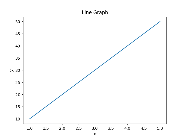
In this case, plt(x, y) defines the x and y to plot. Xlabel and ylabel are used to label the axes. Plt.title() is used to insert a title. Plt.show() is used to show the graph - without this last component, the graph will not show up.
Two Lines
In this case, we wish to graph two lines onto one graph. In this case, the only way for python to know which graph is which is by using the “label” tag to add “Line 1” and “Line 2”.
import matplotlib.pyplot as plt

x = [1, 2, 3, 4, 5]
y1 = [10, 20, 30, 40, 50]
y2 = [25, 36, 45, 55, 66]

line1 = plt.plot(x, y1, marker='o', label='Line 1')
line2 = plt.plot(x, y2, marker='o', label='Line 2')
plt.xlabel("x-axis")
plt.ylabel("y-axis")
plt.title("Line Graphs")
plt.legend()
plt.show()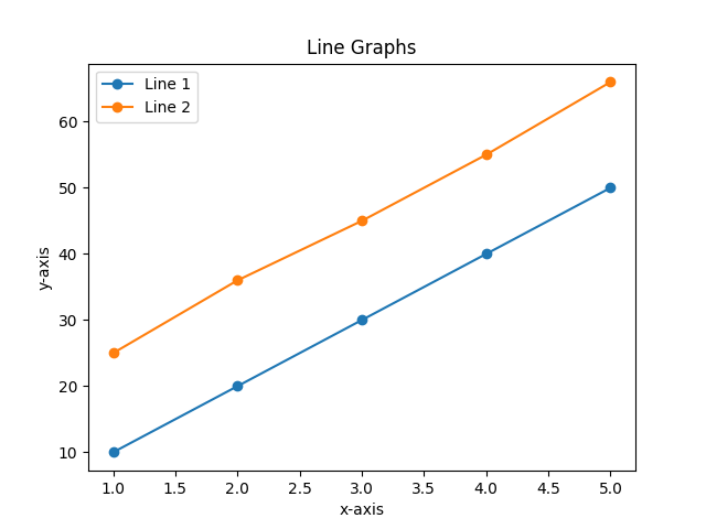
To add a legend for two or more lines, the “label” tag (for example, label= “Line 1”) is absolutely necessary.
FacetGrid
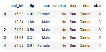
In this instance, we’ll use a dataset that is built into python. First, let’s import what we need:
import matplotlib.pyplot as plt
import seaborn as sns
Next, let’s load the dataset we want:
data = sns.load_dataset("tips")The following is a sample of the “tips” dataset (the first 5 data).
However, you can get choose another dataset by typing the following:
print(sns.get_dataset_names())Now, we need to create the templates. Here, we must first specify the dataset that we will use, then the row tag, and the column tag. This will generate four blank graphs.
graph = sns.FacetGrid(data, row="sex", col="time")Now, let’s choose to add a scatter plot to the empty templates. Here, using the map function, we ask that a scatter plot be drawn with the x-axis as “total_bill” and y-axis as “tip”.
graph = graph.map(plt.scatter, 'total_bill', 'tip')

plt.show()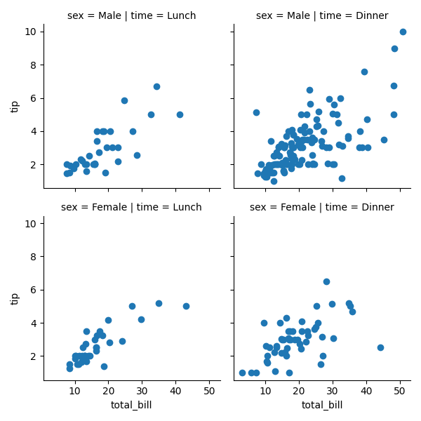
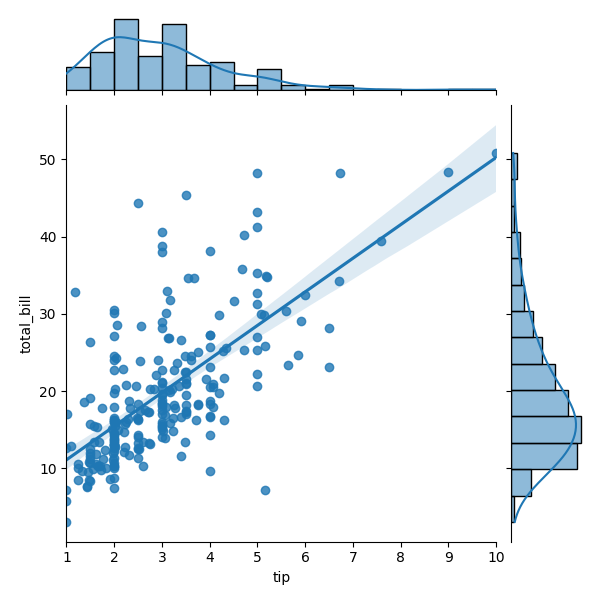
Joint Plot
In a joint plot, you have two plots on one graph.
import matplotlib.pyplot as plt
import seaborn as sns

graph = sns.load_dataset("tips")
sns.jointplot(x="tip", y="total_bill", data=graph, kind="reg")
plt.show()
With the data tag, we specify the dataset, and the kind tag, we have asked for a regression (however, you can specify others).
JointGrid
In this particular graph, I’m going to join two different graphs into one. Using .plot_joint(sns.kdeplot, fill=True), we have asked python that we want a kdeplot as the main plot. Using .plot_marginals(sns.boxplot), we have added boxplots on the margins.
import matplotlib.pyplot as plt
import seaborn as sns

graph = sns.load_dataset("tips")
matrix = sns.JointGrid(data=graph, x="total_bill", y="tip")
matrix = matrix.plot_joint(sns.kdeplot, fill=True)
matrix = matrix.plot_marginals(sns.boxplot)
plt.show()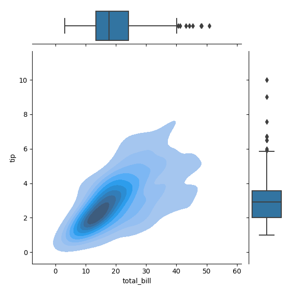
Rel Plot
import matplotlib.pyplot as plt
import seaborn as sns

graph = sns.load_dataset("tips")
sns.relplot(x="total_bill", y="tip", hue="sex", size="time",data=graph)
plt.show()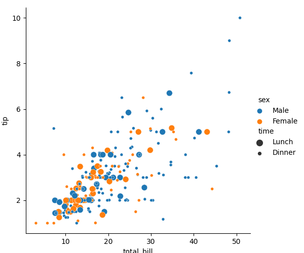
Regression Plot
As the name suggests, in this plot, we can plot regression plots.
import matplotlib.pyplot as plt
import seaborn as sns

graph = sns.load_dataset("tips")
sns.lmplot(x="tip", y="total_bill", col="time", row="sex", data=graph)
plt.show()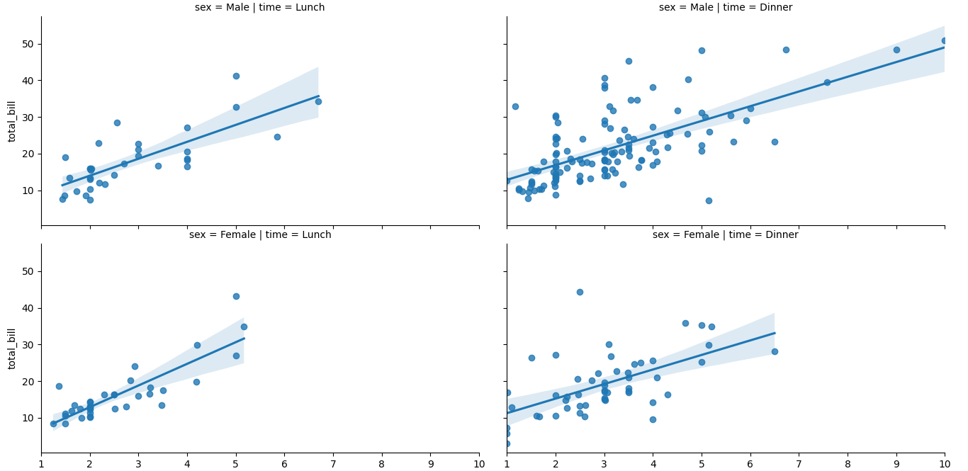
Pair Plot
In a pair plot, you get a matrix of graphs. The hue tag allows us to separate categorical data; in this case, the data points are coloured orange and blue based on sex.
import matplotlib.pyplot as plt
import seaborn as sns

graph = sns.load_dataset("tips")

sns.pairplot(graph, hue=”sex”)

plt.show()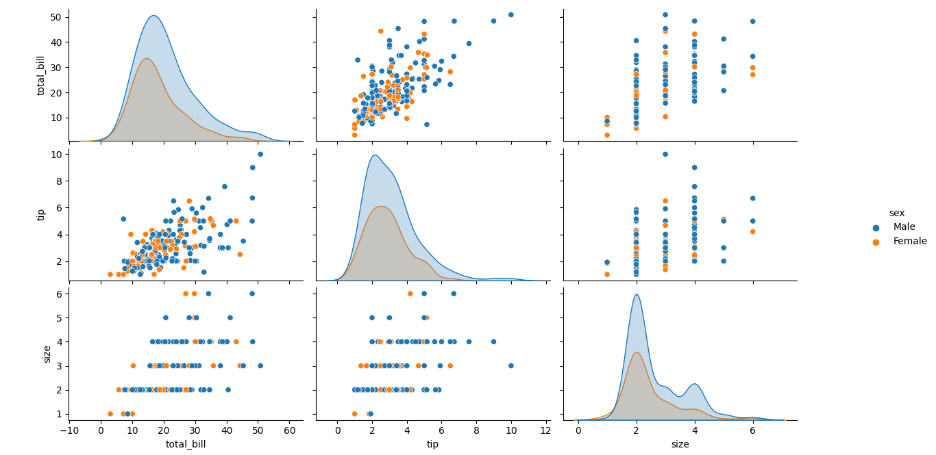
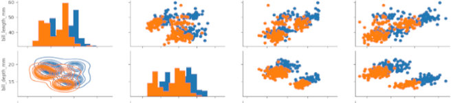
PairGrid
Pairgrid gives you a lot more control over the plots that you see in a Pairplot. For example:
import matplotlib.pyplot as plt
import seaborn as sns

graph = sns.load_dataset("penguins")
matrix = sns.PairGrid(graph, hue='sex')
matrix.map_diag(plt.hist)
matrix.map_upper(plt.scatter)
matrix.map_lower(sns.kdeplot)
plt.show()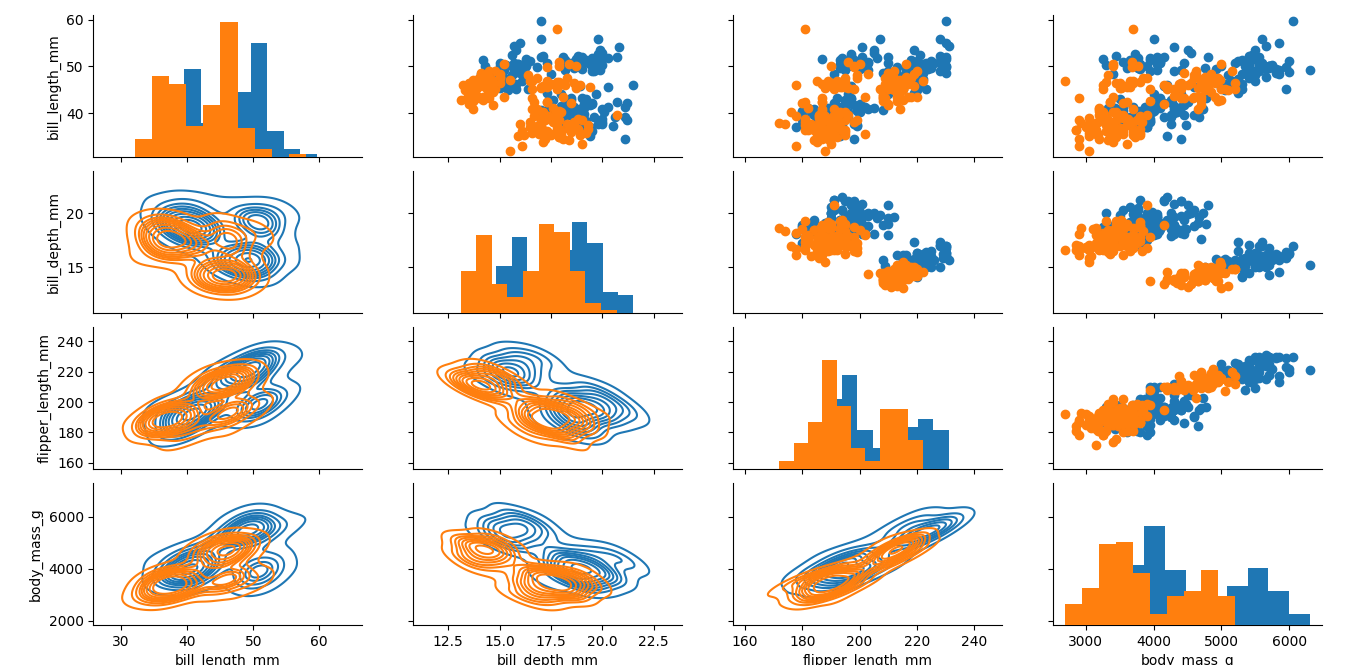
In this case, we use the map_diag, map_upper, and map_lower to specify the type of graphs we want in the upper, lower and diagonal sections of the graph. In this case, we have asked python to plot histograms on the diagonal, scatterplots on the upper right section, and kdeplots on the lower left section.
HeatMap
In a heatmap, data is displayed based on a correlation matrix. As such, the first thing to do is to generate the correlation matrix using .corr(). Once the matrix has been generated, you just plot it. In this case, the annot tag will add numbers onto the graph.
import matplotlib.pyplot as plt
import seaborn as sns

graph = sns.load_dataset("tips")
matrix = graph.corr()
sns.heatmap(matrix, annot=True)
plt.show()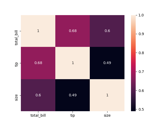
Alternatively, one can also do the following:
import matplotlib.pyplot as plt
import seaborn as sns

graph = sns.load_dataset("flights")

matrix = graph.pivot_table(index="year", columns="month", values="passengers")

sns.heatmap(matrix)
plt.show()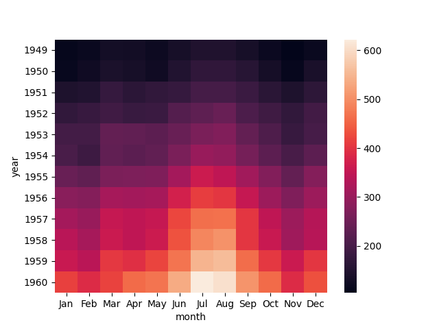
ClusterMap
In a clustermap, similarity between samples is used to re-order the heatmap.
import matplotlib.pyplot as plt
import seaborn as sns

graph = sns.load_dataset("iris")
matrix = graph.pop("species")
sns.clustermap(graph)
plt.show()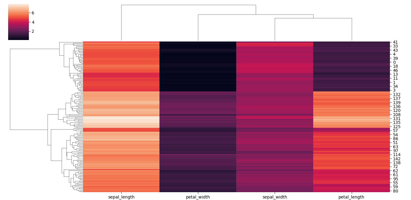
Happy graphing!